Objectives
Successful students will be able to perform the following:
- Create a site from a common industry-standard template
- Read existing professional code in order to make original changes
- Employ a card-based user interface design language
- Transform a wireframe design to structural, semantic HTML5
- Create a simple responsive layout using flexbox
- Create a fixed navigation menu
- Practice git branching and merging
- Publish custom bespoke sites using github pages
Overview
The site for this assignment is your own personal web development notebook. You will start this page during this assignment and add to it each week. For an example, see Stephanie Argy’s journal
We strongly recommend that you work in pairs, organizing your study time to work together and support each other. Each of you will produce your own site, but you will be able to share techniques and troubleshooting.
Resources
Please visit the following resources.
- HTML 5 Boilerplate
- Why cards are the future of the web
- The Complete Guide to an Effective Card-Style Interface Design
Please read one or more of the following references and use the following cheatsheet as you perform Part 2.
- Short intro article (required): A Complete Guide to Flexbox
- More in-depth MDN article: Using CSS flexible boxes
- Some cool recipes: Harnessing Flexbox for Today’s Web Apps
- A very helpful article on centering with flexbox (very recommended!): Designing CSS Layouts With Flexbox Is As Easy As Pie
- A cautionary note about making flexbox work in all browsers: On using prefixes in Flexbox
- Official specification:CSS Flexible Box Layout Module Level 1 *Quick reference (required): Flexbox Cheatsheet
The following resources are optional
- You can get a bunch of easy placeholder images at placehold.it (conveniently shows image size) or lorem pixel
- You can get a bunch of fun SVG icons at The Noun Project.
- Here’s a list of fun lorem ipsum generators.
Activities
-
Read the references. Really. At least the required ones. Don’t start coding until you do.
-
Read the whole assignment before you start coding any of it.
-
Estimate how much time you think this might take you. You have a week. Write the estimate down.
-
Keep track of your time. We will ask you how much time you spent.
-
Use the slack channel, your TA’s, and your instructor for help if you get stuck.
Part 0 - set up the assignment
Steps
These steps assume you are able to work with git and github as introduced in Exercise 1.
-
Make a repository named “webdev-notebook” on github.com. Initialize the repo with a README.md file.
-
Clone the repo using ssh to your local machine at
~/Documents/pcs/webdev-notebook . for example, I used this command:git clone git@github.com:Auraelius/webdev-notebook.git -
Create a gh-pages branch both locally and on github.com to set up web hosting
-
Work on the master branch until you deploy to the gh-pages branch
You will start with a set of files called HTML 5 Boilerplate. These files represent best practices for site construction. You may not need all of the parts supplied with HTML 5 Boilerplate, but it will be useful to work with them and become familiar with them.
-
Download this zip file from the HTML 5 Boilerplate web site.
-
Unpack it into a temporary folder named html5-boilerplate_v5. It may do this automatically, depending on how you have your browser configured.
-
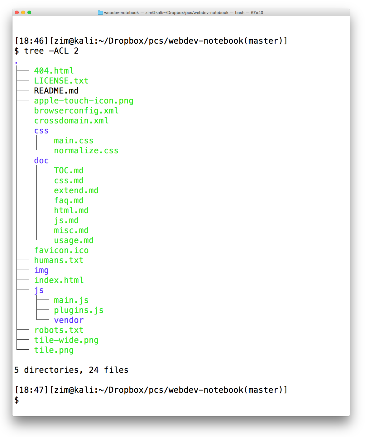
Copy the contents of the html5-boilerplate_v5 folder to your webdev-notebook folder. Make sure the file structure looks like this:
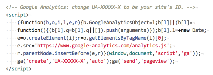
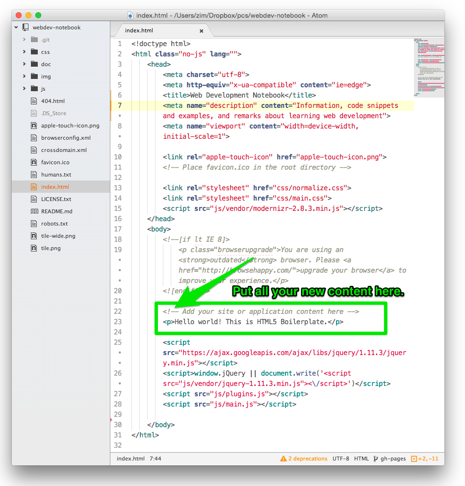
- Clean up the boilerplate index.html file by removing this block of HTML
-
Update the title element and the meta tag description content attribute
-
Add all the files, commit them, and push master to github.
-
Merge from master to gh-pages and push to publish your file to the web
-
Verify that your site is available on the web.
From this point on, you will add new HTML content here:
Part 1 - Analyze the wireframe and develop the html element structure.
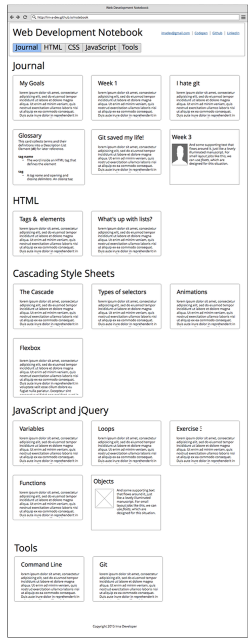
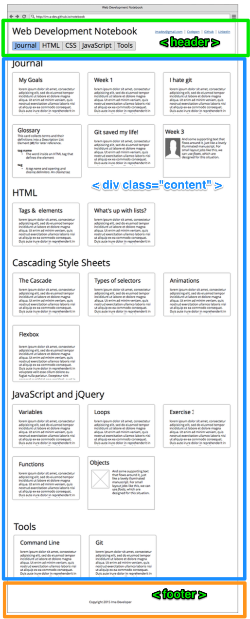
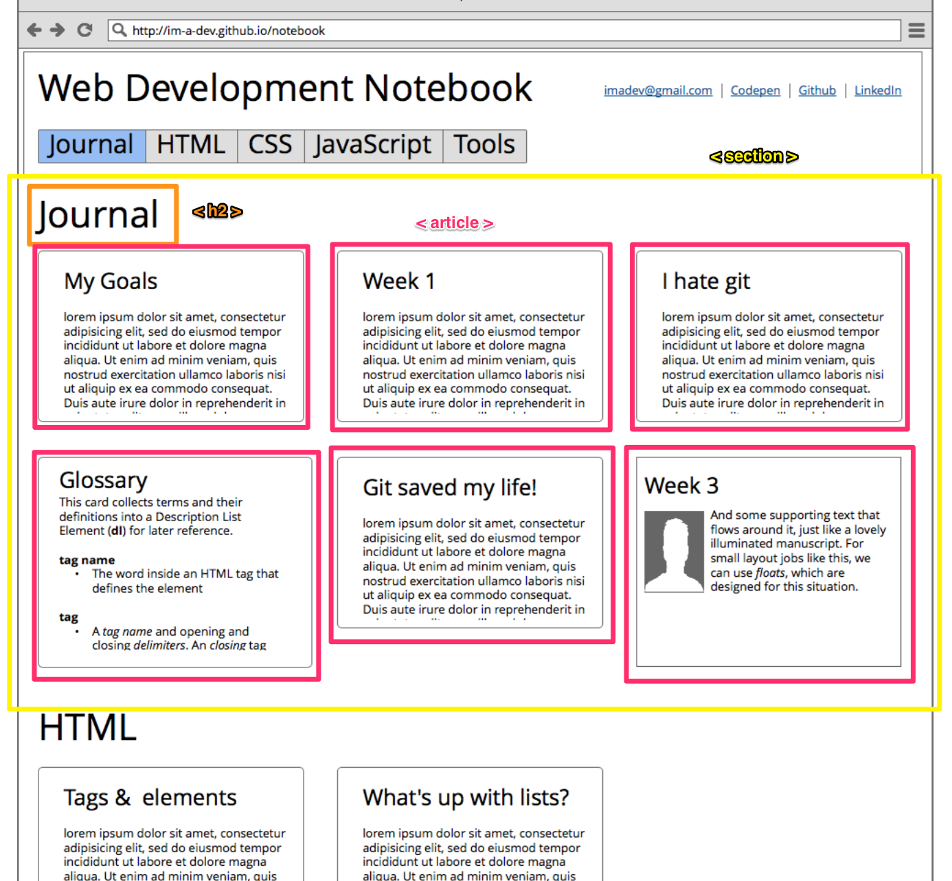
Here’s what the page will eventually look like.
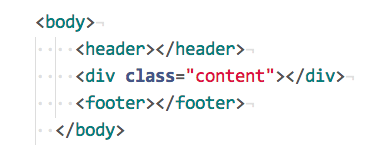
The top-level of most pages (and this one) is to have three children of the <body> tag.
If we draw the boxes of these elements on the wireframe, it might look like this:
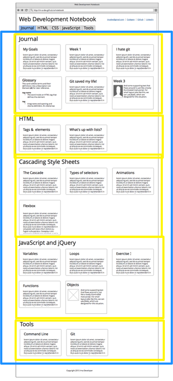
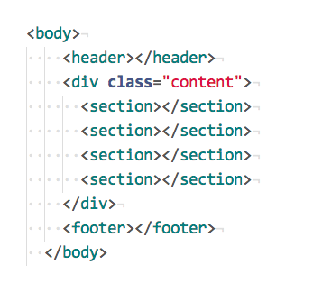
Going further, we can see a repeating structure inside the main content of the page. There are multiple sections.
And the code might look like this:
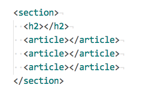
Each section has a heading and a number of articles, like this:
And the code might look like this:
Steps
-
Update index.html with the structure of the page. Don’t worry about the header and footer yet.
-
Use the section titles from the wireframe.
-
Use gibberish or “lorem ipsum” text for the article headings and paragraph text.
-
Let the articles just stack in a single column. Don’t worry about making them line up in rows yet.
-
Use the CSS from Exercise 1 to style your articles so they have borders, etc.
-
Test, add, commit, and push your code on master
-
Merge your code to gh-pages and push to deploy your site.
-
View your site on the web.
Part 2 - Use flexbox to lay out each section
Flexbox is a relatively new feature of CSS that allows excellent control of where things are positioned on the page. It replaces older methods like tables or floats.
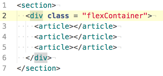
The first step is to simply enclose the articles in a flex container. This takes over control of the layout algorithm from the default block layout. We can use a simple div for this:
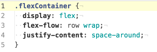
Then, on the CSS side, we style the flex container something like this (You may have to add vendor prefixes and play around until you find the correct combination. Refer to the references for help):
Steps
-
Read at least one of the flexbox references before coding. Really.
-
Modify your section elements to include a flex container div
-
Modify your CSS to enable the flex layout behavior
-
Test your layout by narrowing the browser to the smallest possible width. It should turn back in to a single column layout.
-
Test, add, commit, and push your code on master
-
Merge your code to gh-pages and push to deploy your site.
-
View your site on the web.
Part 3 - Centered Footer
More Flexbox! Look up the article on centering with flexbox to see how this works.
Steps
-
Use your mad flexbox skillz to center the copyright notice horizontally and vertically in the footer.
-
Test, add, commit, and push your code on master
-
Merge your code to gh-pages and push to deploy your site.
-
View your site on the web.
Part 4 - Fancy Header
In this section, you create an oh-so-trendy “fixed nav” element.
Steps
-
Inside the header, create a page H1 and a set of links to your other information like a link to your github, a mailto: URL so people can send you email, and a link to your linkedin profile.
- Create a nav element to act as a navigation menu to the sections on the page.
- Each section should have a unique ID that you can use in the navigation links
- Inside the nav element, use an unordered list.
- Each list items should be a link to a section.
- Change the list item elements to inline-block so they appear next to each other but still can be given padding and margin.
-
Use “fixed” positioning on the entire header element so that it stays at the top of the viewport as you navigate to different sections.
-
Adjust the styling of the sections (or the body or some other element) so that the section title doess not disappear behind header when you navigate to a new section.
-
Test, add, commit, and push your code on master
-
Merge your code to gh-pages and push to deploy your site.
- View your site on the web.
Part 5 - Modify the color palette & font
Let’s make it look unique.
Steps
-
Create a coherent color palette using Adobe Color CC
-
Put some comments at the front of main.css that list the color values you’ve chosen like this:
/*
primary color - #f0f0f0
text color - #101010
background color - #520DB2
accent color - #FF9D20
warning color -#14FF2F
error color - #B21209
*/
-
Don’t use these colors!
-
Use the colors you’ve chosen as background and content colors on some elements of your layout so that it looks good to you.
-
(Optional) Feel free to add subtle gradients to the background colors.
-
(Optional) Use a different design for cards in different sections. For example, have a distinct h2 appearance for HTML cards compared with CSS cards, etc.
-
Change the font to a face likely to be present on everybody’s computer.
-
Test, add, commit, and push your code on master
-
Merge your code to gh-pages and push to deploy your site.
-
View your site on the web.
Part 6 - Add meaningful content to your notebook
Each week, we will ask you to add information to this file and republish it. We’ll ask you to use the HTML, CSS, and JS features you’ve learned and to give us feedback on how the class is going for you.
Steps
- Bring your cards over from exercise 1
- Add a card about what you learned about flexbox
- Add a card about CSS positioning
- Add a card that discusses the pros and cons of card interfaces. What works? What is wrong with them?
- Remove any placeholder cards, but be sure that every section has at least one card in it.
- Test, add, commit, and push your code on master
- Merge your code to gh-pages and push to deploy your site.
- View your site on the web.
Part 6 - Going Further!
If this isn’t enough for you, check out Stephanie’s Advanced Challenges and add one or more of them to your notebook.