Objectives
- Create an HTML-only web site (“So Retro!”)
- Add styling to make a mobile-first design
- Use media queries to extend this styling to larger screen formats
- Use Scalable Vector Graphhics (SVG) to create responsive logos
- Use responsive image techniques to reduce bandwidth and improve usability
- Use jQuery to add mobile interaction patterns
- Publish the site using github pages
- Work on a small team
Overview
The site is a single page with a set of at least three articles. Articles can have any number of paragraphs. Every article has a picture. Your design should work with at least 20 or more articles.
The logo should be SVG and 75x75px without any styling. In the “small” mobile version, it should be 100x100. In the “medium” mobile, it should be 200x200.
The page title is used differently in all three layouts. See the wireframes for details.
The articles should scroll, but no scroll bar should appear. They are too small a target for mobile use. On a device, you should be able to flick them up and down easily and use the nav menu to jump to any article.
Each article will have one image. They should be very small in the HTML-only version, very small in the mobile version, and larger with a click-through to full size on the large version.
Test your work using Chrome Developer Tools in “device mode.” device-mode
Feel free to use real devices to test your site when it is live on the web.
Resources
- You can get a bunch of easy placeholder images at placehold.it (conveniently shows image size) or lorempixel
- You can get a bunch of fun SVG icons at The Noun Project.
- Here’s a list of lorem ipsum generators.
Things to do
Part 0 - set up the assignment
Steps
- Make a repository and establish a remote on github.com. This should be review
- Create a gh-pages branch both locally and on github.com to set up web hosting
- Work on the master branch unless you are deploying via the gh-pages branch
- Create a simple HTML file with minimal content
- Add, commit, and push your file to github.com on master
- Merge from master to gh-pages and push to publish your file to the web
- Verify that your file is available
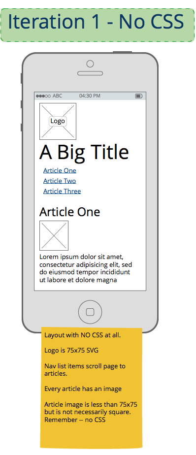
Part 1 - Create a no-CSS, no-JavaScript site that works on a smart phone in portrait mode.
Wireframe:

Steps
- Create HTML for
- a heading
- a logo sized to 75x75 without CSS
- a nav panel
- a contents panel with a bunch of articles.
- Each article should have a title, an image, and a couple paragraphs of text.
- Be sure to put the various elements in the proper order.
- Do not use any JavaScript or CSS
- Think ahead to the requirements of the styled versions, but do not add any HTML that only supports styling.
- Test, add, commit, and push your code on master
- Merge your code to gh-pages and push to deploy your site.
- View your site on your phone to observe how it behaves.
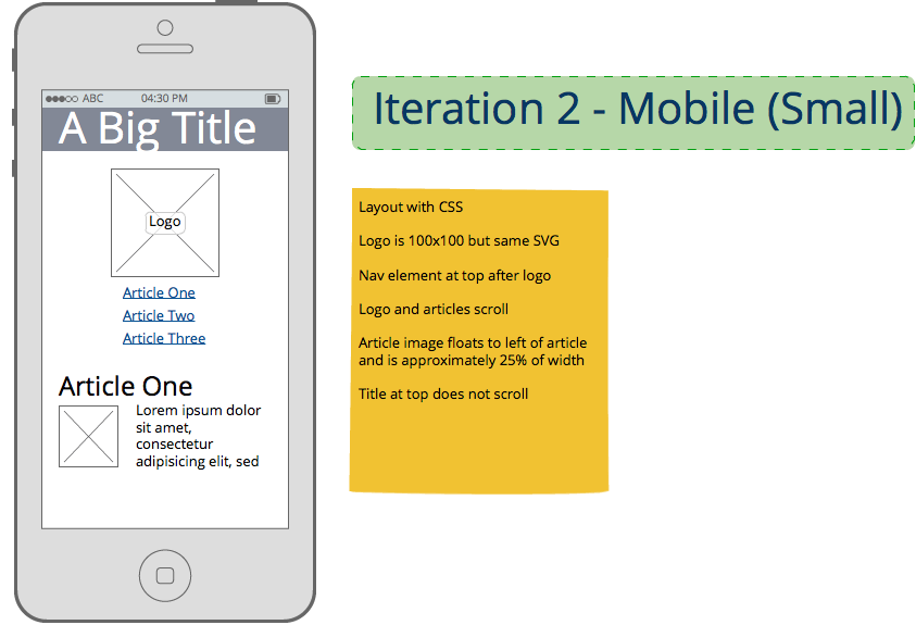
Part 2 - Progressively enhance the site to use mobile-first conventions
Wireframe:

Use CSS and JavaScript to style the site using mobile user interface patterns:
- Non-scrolling, semi-transparent title bar at top
- SVG logo that is resized to 100x100
- Content should appear to scroll beneath the title menu bar
- Navigation menu below logo
- This should use fluid layout so that it works in either portrait or landscape mode on a “small” smartphone. Do not use media queries to handle orientation in this step.
Steps
- Add a stylesheet to implement the mobile user interface elements
- Do not change any HTML. You may add classes.
- Resize the logo to 100x100
- Float all article images left and size them to no more than 25% of the content by width. They can be any height.
- Use small, cropped, high-compression, low-resolution images.
- Test, add, commit, and push your code on master
- Merge your code to gh-pages and push to deploy your site.
- Test on your phone and on Chrome Developer Tools as a variety of phones.
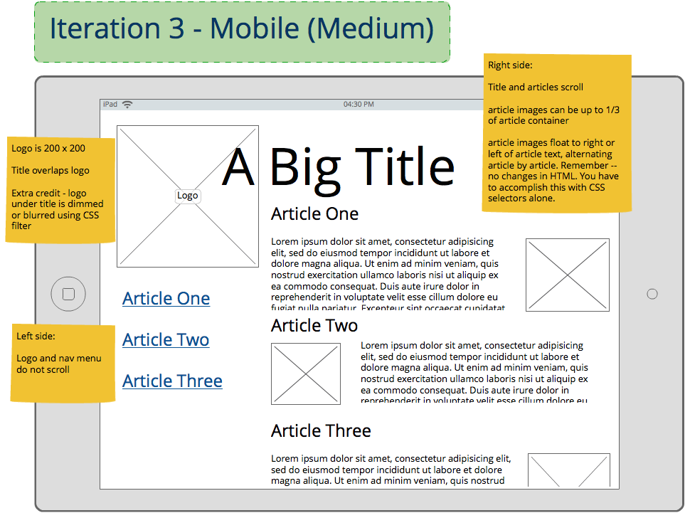
Part 3 - Use Responsive Design techniques to progressively enhance the site for larger screens
Wireframe:

Use media queries to adapt layout to a “medium” mobile device - a tablet - in landscape orientation. It is up to your discretion to handle “medium” portrait orientation either by fluid layout or media query. You must have at least one media query.
Add responsive images to all articles. * Use small, cropped, high-compression images for html-only and mobile versions * Use larger, low-compression images for larger layouts * Use media queries to manage the two layouts * Use fluid image layout to deal with device variations within different devices Example: http://codepen.io/Auraelius/pen/sClka?editors=110
Steps
- Use one media query to detect when the layout is larger than a landscape phone
- Use CSS to in the media query to
- adjust the logo to be 200x200
- Slightly overlay the page title on top of the logo
- Keep the nav panel visible at all times, but, if there are enough article titles, scroll the nav panel independant of the content panel. Rember, your design must work for a large number of articles.
- Ese larger images for this layout but constrain them to no more than 30% of the content panel width. (not the device width).
- Float the images within the articles using alternating left and right positions. Do not change any HTML. You must use a CSS selector technique to accomplish this.
- Test, add, commit, and push your code on master
- Merge your code to gh-pages and push to deploy your site.
- Test on your phone and on Chrome Developer Tools as a couple different tablets.
Extra credit!!!
Here are some ideas to take your design farther if you have time:
- Embed your logo SVG and add classes to the elements so that
- the logo changes colors, stroke width, or other properties at different media query breakpoints
- the logo is simpler (has fewer elements) when it’s small and more complicated when it’s large
- Use custom fonts
- use readable, built-in, simple fonts at phone size
- use subtly-styled, more interesting, downloaded fonts at high resolution
- make sure the fonts are not downloaded on the phone to conserve bandwidth
Part 4 - Use jQuery to provide an animated hamburger menu ———————————-
Wireframe:

Use jQuery and CSS classes to create a navigation menu that reveals itself when a “hamburger” icon is clicked.
Full disclosure: “The Hamburger” is so prevalent that we can’t ignore it. But, it is known to have its problems and will probably be replaced by something else.
Steps
- Create a footer with a hamburger menu icon
- Make sure it is fixed to the bottom of the screen and on top of other content.
- Use two CSS classes to control the position of the main content section.
- Have it overlay the menu to start
- Have it move to the right when the hamburger menu is clicked.
- Have it return to the original position when one of the navigation links is clicked.
- Test, add, commit, and push your code on master
- Merge your code to gh-pages and push to deploy your site.
- Test on your phone and on Chrome Developer Tools as a couple different tablets.
Extra credit!!! ————————— Here are some ideas to take your design farther if you have time:
- Make sure your design “works” if JavaScript is disabled.
- Reveal the nav menu in response to a “swipe-righ” gesture
